Create a 3D Map in Excel – Instructions
Create a 3D Map in Excel: Video Lesson
This video lesson, titled “Creating a New 3D Maps Tour,” shows you how to create a 3D Map in Excel. This video lesson is from our complete Excel tutorial, titled “Mastering Excel Made Easy v.2019 and 365.”
Create a 3D Map in Excel: Overview
Creating a New Tour
After enabling the 3D Maps add-in in Excel, you can then create a 3D Map in Excel. To create a 3D Map in Excel, click the “Insert” tab in the Ribbon. Then directly click the “3D Maps” button in the “Tours” button group. Alternatively, click the drop-down part of the button and select the “Open 3D Maps” command from the drop-down menu. The 3D Maps add-in then opens and creates a new tour for you if you haven’t yet created any tours in 3D Maps. This tour is named “Tour 1,” by default.
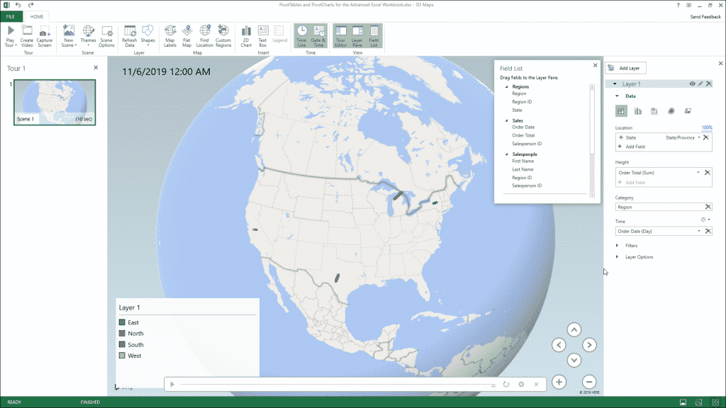
A separate “3D Maps” window then opens. It contains a Ribbon that with a “File” and “Home” tab at the top of the window. Below that, a list of scenes for the current tour appears in the “Tour Editor” pane at the left side of the window. The currently selected scene’s map data then appears in the middle pane to the right of that. Floating over this area is a “Field List” pane that contains the data from your data model. The “Layer Pane” appears at the right side of the window. This is where you edit the currently selected layer in your 3D Map. By default, this layer is named “Layer 1.”
Mapping Geographic Data
The first thing to do when creating a new tour is add the geographic data to map from the Field List to the desired layer in the Layer Pane. To do this, click and drag the geospatial data field to map from the Field List and then release it over the “Location” field within the “Data” section in the Layer Pane. Excel then attempts to identify and map the geospatial data in the layer.
The type of geospatial data that Excel thinks this field contains appears in a “geographical type” drop-down to the right of the field in the “Location” field. If Excel picks the wrong “geographical type” of data, you can click this drop-down to select the correct type of geographical data the field contains. Excel’s mapping confidence of the data field appears as a percentage above and to the right of the “Location” field. To delete a data field from the “Location” field list, click the “Delete Field” button at the data field’s right end within the “Location” field. Also note that you can add multiple geographical data fields to the “Location” field, if needed.
Selecting a Visualization Type
Next, you can select the visualization type for this layer by clicking the desired visualization type button at the top of the “Data” section in the Layer Pane. The type of data visualization you choose changes the fields and options available in the Layer Pane. Also, you can only choose the “Region” visualization type if you have regional geographical data available in the “Location” field. This is why you should add your geographical data to the “Location” field, first.
Mapping the Height, Size, or Value Data
Then click and drag the data field or data fields with the values to measure and map from the Field List pane into either the “Height,” “Size,” or “Value” field within the Layer Pane. The name of this field changes, depending on which visualization type you selected. Data fields added to this field within the Layer Pane are treated in much the same way as fields added to the “Values” section of the PivotTable Fields or PivotChart Fields task pane are.
By default, data fields added to the “Height,” “Size” or “Value” field within the Layer Pane are added together using the “SUM” function. You can click the drop-down button to the right of any data field in this list to select a different aggregate function to perform and map, if desired. To remove a data field from this list, simply click the “Delete Field” button at its right end in this field list.
Mapping Category Data
Next, if desired and if available for the data you are mapping in the “Height,” “Size” or “Value” field within the Layer Pane, you can then click and drag the field by which to categorize the mapped data from the Field List into the “Category” field in the Layer Pane. Note that the “Category” field in the Layer Pane is not available if you selected the “Heat Map” visualization type. The selected data field then becomes the legend for the mapped data. A legend for the selected field’s values also appears over the data map. You can only have one “Category” data field per layer. To remove a data field from the “Category” field in the Layer Pane, simply click the “Delete Field” button at its right end.
Mapping Time Data
Finally, to show the changes to the mapped data values over time, click and drag the field with the temporal (date/time) values from the Field List into the “Time” field in the Layer Pane. You can only have one “Time” field per layer. The values in this data field then provide the range of date/time values shown in the tour’s animation. To change the duration of time by which to map the related values within the “Height,” “Size” or “Value” field within the Layer Pane, click the drop-down to the right of the data field in the “Time” field in the Layer Pane. Then select the desired unit of time from the drop-down that appears.
To change whether the data mapped by the related values within the “Height,” “Size” or “Value” field within the Layer Pane show for an instant, display cumulatively, or are replaced by new values as the timeline progresses, click the “clock” icon drop-down button above and to the right of the “Time” field in the Layer Pane. Then select the desired display of the mapped data over time from the drop-down menu that appears. To remove a data field from the “Time” field in the Layer Pane, simply click the “Delete Field” button at its right end.
Final Steps
You can then change the view of the 3D Maps tour by clicking the “Tilt up,” “Tilt down,” “Rotate Left,” and “Rotate Right” buttons in the map. You can also click the “Zoom in” and “Zoom out” buttons to increase or decrease the map magnification. To preview the tour, click the “Play” button in the Time Line at the bottom of the map. If you don’t see the Time Line, you can click the “Time Line” button in the “Time” button group on the “Home” tab of the Ribbon in the 3D Maps window to toggle it on. Clicking this same button also turns it off.
Create a 3D Map in Excel – Instructions: A picture of a user creating a new 3D Maps tour in Excel.
When you want to close the tour, click the “X” button in the upper-right corner of the 3D Maps window. Alternatively, click the “File” tab of the Ribbon in the 3D Maps window and then select the “Close” command from the drop-down menu that appears. You do not directly save changes to a 3D Map, as its changes are saved when you next save the changes to the workbook within which it is contained.
Create a 3D Map in Excel: Instructions
Instructions on How to Create a New Tour
- To create a 3D Map in Excel, click the “Insert” tab in the Ribbon.
- Then either directly click the “3D Maps” button in the “Tours” button group or click the drop-down part of the button and select the “Open 3D Maps” command from the drop-down menu.
- The 3D Maps add-in then opens and creates a new tour for you if you haven’t yet created any tours in 3D Maps. This tour is named “Tour 1,” by default.
- Within the separate “3D Maps” window that opens, you will see a Ribbon that consists of a “File” and “Home” tab at the top of the window.
- Below that, a list of scenes associated with the current tour appears in the “Tour Editor” pane at the left side of the window.
- The currently selected scene’s map data then appears in the middle pane to the right of that.
- Floating over this area is a “Field List” pane that contains the data from your data model.
- At the right side of the window is the “Layer Pane,” which lets you edit the currently selected layer in your 3D Map. By default, this layer is named “Layer 1.”
Instructions on Mapping Geographic Data
- To add the geographic data to map from the Field List to the desired layer in the Layer Pane, click and drag the geospatial data field to map from the Field List and then release it over the “Location” field within the “Data” section in the Layer Pane.
- Excel then attempts to identify and map the geospatial data in the layer. The type of geospatial data that Excel thinks this field contains appears in a “geographical type” drop-down to the right of the field in the “Location” field.
- If Excel picks the wrong “geographical type” of data, you can click this drop-down to select the correct type of geographical data the field contains.
- Excel’s mapping confidence of the data field appears as a percentage above and to the right of the “Location” field.
- To delete a data field from the “Location” field list, click the “Delete Field” button at the data field’s right end within the “Location” field.
- Also note that you can add multiple geographical data fields to the “Location” field, if needed.
Instructions on Selecting the Visualization Type
- To select the visualization type for this layer, click the desired visualization type button at the top of the “Data” section in the Layer Pane.
- The type of data visualization you choose changes the fields and options available in the Layer Pane. Also, you can only choose the “Region” visualization type if you have regional geographical data in the “Location” field. This is why you should add your geographical data to the “Location” field, first.
- Then click and drag the data field or data fields with the values to measure and map from the Field List pane into either the “Height,” “Size” or “Value” field within the Layer Pane, depending on which visualization type you selected.
- Data fields added to this field within the Layer Pane are treated in much the same way as fields added to the “Values” section of the PivotTable Fields or PivotChart Fields task pane are. By default, data fields added to the “Height,” “Size” or “Value” field within the Layer Pane are added together using the “SUM” function.
- To select a different aggregate function to perform and map, if desired, click the drop-down button to the right of any data field in this list.
- To remove a data field from this list, click the “Delete Field” button at its right end in this field list.
Instructions on Mapping Category Data
- Next, if desired and if available for the data you are mapping in the “Height,” “Size” or “Value” field within the Layer Pane, you can then click and drag the field by which to categorize the mapped data from the Field List into the “Category” field in the Layer Pane. Note that the “Category” field in the Layer Pane is not available if you selected the “Heat Map” visualization type.
- The selected data field then becomes the legend for the mapped data. A legend for the selected field’s values also appears over the data map. You can only have one “Category” data field per layer.
- To remove a data field from the “Category” field in the Layer Pane, simply click the “Delete Field” button at its right end.
Instructions on Mapping Time Data
- Finally, to show the changes to the mapped data values over time, click and drag the field with the temporal (date/time) values from the Field List into the “Time” field in the Layer Pane. You can only have one “Time” field per layer. The values in this data field then provide the range of date/time values shown in the tour’s animation.
- To change the duration of time by which to map the related values within the “Height,” “Size” or “Value” field within the Layer Pane, click the drop-down to the right of the data field in the “Time” field in the Layer Pane and then select the desired unit of time from the drop-down that appears.
- To change whether the data mapped by the related values within the “Height,” “Size” or “Value” field within the Layer Pane show for an instant, display cumulatively, or are replaced by new values as the timeline progresses, click the “clock” icon drop-down button above and to the right of the “Time” field in the Layer Pane.
- Then select the desired display of the mapped data over time from the drop-down menu that appears.
- If you want to remove a data field from the “Time” field in the Layer Pane, click the “Delete Field” button at its right end.
Final Steps to Finish and Create a 3D Map in Excel
- To change the view of the 3D Maps tour, click the “Tilt up,” “Tilt down,” “Rotate Left,” and “Rotate Right” buttons in the map.
- To change the magnification of the 3D Maps tour, you can also click the “Zoom in” and “Zoom out” buttons to increase or decrease the map magnification.
- If you want to preview the tour, click the “Play” button in the Time Line at the bottom of the map.
- To show the Time Line, if needed, click the “Time Line” button in the “Time” button group on the “Home” tab of the Ribbon in the 3D Maps window to toggle it on. Clicking this same button also turns it off.
- To close the tour, either click the “X” button in the upper-right corner of the 3D Maps window or click the “File” tab of the Ribbon in the 3D Maps window and then select the “Close” command from the drop-down menu that appears.
- You do not directly save changes to a 3D Map, as its changes are saved when you next save the changes to the workbook within which it is contained.