Insert a Modern Chart in Access- Instructions
Insert a Modern Chart in Access: Video
This video lesson, titled “Insert a Modern Chart,” shows how to insert a modern chart in Access and then format a modern chart in Access. This video is from our complete Access tutorial, titled “Mastering Access Made Easy v.2019 and 365.”
Overview of Modern Charts in Access
You can insert a modern chart in Access 2019 or 365 into a report in Access. All charts in Access are inserted as a report control. Unlike other report controls, chart controls use their own data source to chart the data. Therefore, you can insert it into a blank, unassociated report, if desired, by clicking the “Report Design” button in the “Reports” button group on the “Create” tab of the Ribbon. However, note that you cannot use the “Chart Wizard” to insert a modern chart in Access. That is only available when inserting the older Microsoft Graph chart controls.
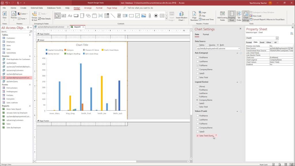
How to Insert a Modern Chart in Access
To insert a modern chart into a report in Access, click the “Insert Modern Chart” button in the “Controls” button group on the “Design” tab of the “Report Design Tools” contextual tab in the Ribbon. Then roll over the general chart type to insert in the drop-down menu. If your choice displays a side menu of sub-choices, then roll over the side menu and hover over the specific subtype to insert. Then click the type of chart to insert in the drop-down menu.
Then click and drag over the area in the report you want the chart to cover. When you release your mouse button, you insert a modern chart of the selected type into the report and open the “Chart Settings” pane at the right side of the screen.
The “Chart Settings” pane in Access lets you select the data for the modern chart and format its chart elements. On the “Data” tab in the “Chart Settings” pane, select either the “Tables,” “Queries,” or “Both” option button under the “Data Source” setting to filter the choices that then appear in the drop-down below it. After selecting the desired option, then click the drop-down below it to select the desired table or query to use as the chart’s data source.
Also notice the new “Format” tab that then appears at the top of the pane and which you can use to format the chart, which we will discuss momentarily.
A picture of a user changing the chart settings after they insert a modern chart in Access.
How to Format a Modern Chart in Access
To then format the modern chart in Access, click the “Format” tab at the top of the “Chart Settings” pane. Then select the series to format from the “Data Series” drop-down. The formatting options that then follow vary by the chart type selected.
However, for many chart types, you can change the “Display Name” field’s value to change the display name of the selected data series within the chart’s legend. If applicable, you can select whether to chart the selected series on the primary or secondary axis by selecting “Primary” or “Secondary” from the “Plot Series On” drop-down.
To change the fill color of the series, select a choice from the “Series Fill Color” drop-down. To change the line color of the series, select a choice from the “Series Line Color” drop-down. To show data labels for the series, check the “Display Data Label” checkbox.
To apply a trendline, select a trendline type from the “Trendline Options” drop-down. To name a trendline, if added, type its name into the “Trendline Name” field. For line charts, you can also select options to format the “Line Weight,” “Dash Type,” and “Marker Shape.”
To apply additional, advanced formatting options to modern charts in Access, ensure the modern chart control is selected in the report design view and then change the desired property field settings on the “Format” tab of the “Property Sheet” pane. Here you can change the desired property settings to do things like add and format a chart subtitle and change the background and line color of the chart. The settings in this pane also let you format the font used for the chart’s axis labels and titles, too.
Instructions on How to Insert a Modern Chart in Access
- To insert a modern chart in Access into a report, click the “Insert Modern Chart” button in the “Controls” button group on the “Design” tab of the “Report Design Tools” contextual tab in the Ribbon.
- Then roll over the general chart type to insert in the drop-down menu.
- If your choice displays a side menu of sub-choices, then roll over the side menu and hover over the specific subtype to insert.
- Then click the type of chart to insert in the drop-down menu.
- Then click and drag over the area in the report you want the chart to cover.
- Release your mouse button to then insert a modern chart of the selected type into the report and open the “Chart Settings” pane at the right side of the screen.
- The “Chart Settings” pane in Access lets you select the data for the modern chart and format its chart elements.
- On the “Data” tab in the “Chart Settings” pane, select either the “Tables,” “Queries,” or “Both” option button under the “Data Source” setting to filter the choices that then appear in the drop-down below it.
- After selecting the desired option, then click the drop-down below it to select the desired table or query to use as the chart’s data source.
- To determine the field or fields to show for the x-axis, or categories, check the desired checkbox or checkboxes under the “Axis (Category)” section below the “Data Source” setting.
- Continuing downward, select the option button for the field to set as the series, or legend, in the “Legend (Series)” section or select the “(None)” choice to omit it.
- Finally, to set the field or fields to show for the y-axis, or values, check the desired checkbox or checkboxes under the “Values (Y axis)” section.
- To change the aggregate function used to calculate the selected field or fields in the “Values (Y axis)” section, hover over the checked field’s name and then click the drop-down arrow that appears to the right of its name.
- Then select the desired aggregate function to show.
Instructions on How to Format a Modern Chart in Access
- To then format the modern chart in Access, click the “Format” tab at the top of the “Chart Settings” pane.
- Then select the series to format from the “Data Series” drop-down.
- The formatting options that then follow vary by the chart type selected.
- However, for many chart types, to change the display name of the selected data series within the chart’s legend, change the “Display Name” field’s value.
- If applicable, to select whether to chart the selected series on the primary or secondary axis, choose “Primary” or “Secondary” from the “Plot Series On” drop-down.
- To change the fill color of the series, select a choice from the “Series Fill Color” drop-down.
- To change the line color of the series, select a choice from the “Series Line Color” drop-down.
- To show data labels for the series, check the “Display Data Label” checkbox.
- To apply a trendline, select a trendline type from the “Trendline Options” drop-down.
- To name a trendline, if added, type its name into the “Trendline Name” field.
- For line charts, you can also select options to format the “Line Weight,” “Dash Type,” and “Marker Shape.”
- To apply additional, advanced formatting options to modern charts in Access, ensure the modern chart control is selected in the report design view.
- Then change the desired property field settings on the “Format” tab of the “Property Sheet” pane.