The Field List in Report Charts in Project – Tutorial
The Field List in Report Charts in Project: Video Lesson
This video lesson, titled “Using the Field List with Report Charts,” shows how to use the Field List in report charts in Project. This video lesson is from our complete Project training, titled “Mastering Project Made Easy v.2013-2010.”
The Field List in Report Charts in Project: Overview
You can use the Field List in report charts in Project to change the data shown in the chart. The Field List in report charts in Project appears in a pane at the right side of the application window. Here you can modify the fields that appear within a selected report chart.
At the top of the “Field List” pane, you can first select either the “Tasks” or “Resources” hyperlinks to use as the source of data for the selected chart. You can then use the “Select Category” drop-down to select a category of field data to display within the chart- either the “Tasks” or “Resources” selected above.
In the “Select Fields” pane below that, you then choose the values to display for the selected category fields. You can click the right-pointing arrows next to each category to collapse and expand the fields shown. You can check the checkbox next to any field to plot its values within the selected chart. You can uncheck a checkbox next to a field to remove it from the chart. The fields shown in the chart appears in a listing at the bottom of the “Select Fields” section.
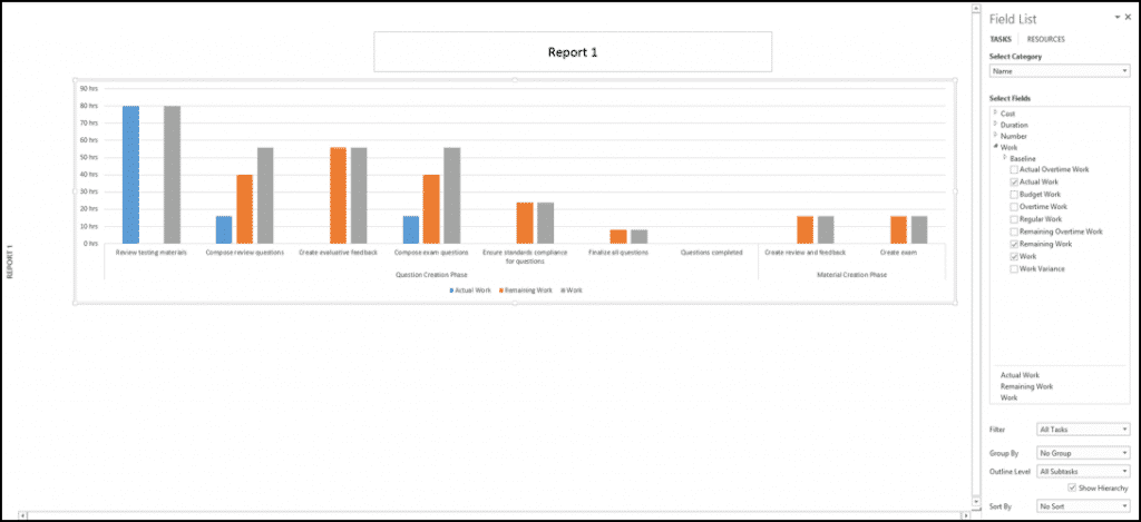
The Field List in Report Charts in Project – Tutorial: A picture of a selected report chart in Project 2013 showing the Field List pane.
At the bottom of the “Field List” task pane, you will see any sorting and grouping options for the selected categories above. You can make a choice from the “Filter” drop-down to apply a filter to the selected task or resource fields. You can use the “Group By” drop-down to create a grouping of those fields by type, if desired. You can use the “Outline Level” drop-down to select which level of detail of tasks you wish to show in the chart. You can check the “Show hierarchy” checkbox to display the hierarchy of tasks within the chart categories, if desired. You can use the “Sort By” drop-down to select a sorting order for the data within the chart.
The Field List in Report Charts in Project: Instructions
- To view the “Field List” pane at the right side of the application window, select a chart within a report.
- Select either the “Tasks” or “Resources” hyperlinks at the top of the “Field List” pane to use your selection as the source of data for the chart.
- Use the “Select Category” drop-down to select a category of field data to display within the chart- either the “Tasks” or “Resources” selected above.
- In the actual “Select Fields” pane below that, choose the values that will be displayed for the selected category fields.
- To collapse and expand the fields shown, click the right-pointing arrows next to each category.
- To plot a field’s values within the selected chart, check the checkbox next to any field.
- To remove a field from the chart, uncheck the checkbox next to the field.
- The fields shown in the chart appears in a listing at the bottom of the “Select Fields” section.
- At the bottom of the “Field List” task pane, you will see any sorting and grouping options for the selected categories above.
- To apply a filter to the selected task or resource fields, make a choice from the “Filter” drop-down.
- To create a grouping of those fields by type, if desired, use the “Group By” drop-down.
- To select which level of detail of tasks you wish to show in the chart, use the “Outline Level” drop-down.
- To display the hierarchy of tasks within the chart categories, if desired, check the “Show hierarchy” checkbox.
- To select a sorting order for the data within the chart, use the “Sort By” drop-down.